Seasonal Charts tab
Seasonal Charts tab is composed by 6 charts that analyze seasonal metrics such as average Return, average Volatility, Winning percentage for all the 12 months.
In the top of the page there are 2 buttons that allow to customize computations and charts:
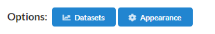
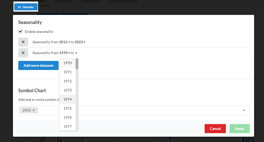
- Datasets
allows to add or modify:- years with which to calculate Seasonality. The default Seasonality used is the Best Seasonality.
- years of Ticker performance. The default shown is the current year performance.
- Appeareance
- it brings you to the page where you can customize the colors of the lines in the charts: the lines of 'Seasonality' and 'Yearly Performances'.
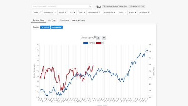
Classic Seasonality chart
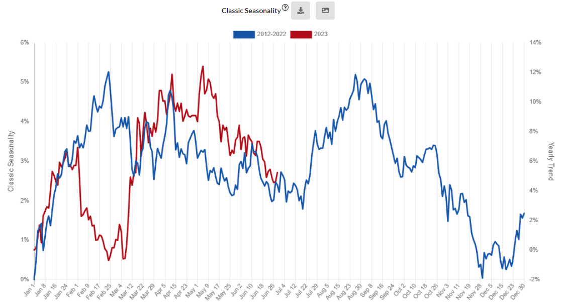
The default chart has 2 lines:
- Classic Seasonality (left scale)
- is the average yearly performance of the Ticker in the selected years.
- is computed as the cumulative sum of the average returns of each trading day of the year.
- Ticker Performance (right scale)
- is the performance of the Ticker in the current year.
Watch the tutorial if you have any doubt.
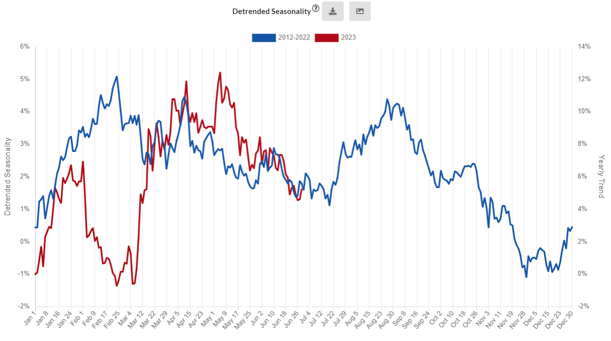
Detrended Seasonality chart
The default chart has 2 lines:
- Detrended Seasonality (left scale)
- is the detrended average yearly performance of the Ticker in the selected years.
- The trend is removed through the linear regression.
- Ticker Performance (right scale)
- is the performance of the Ticker in the current year.
Watch the tutorial if you have any doubt.
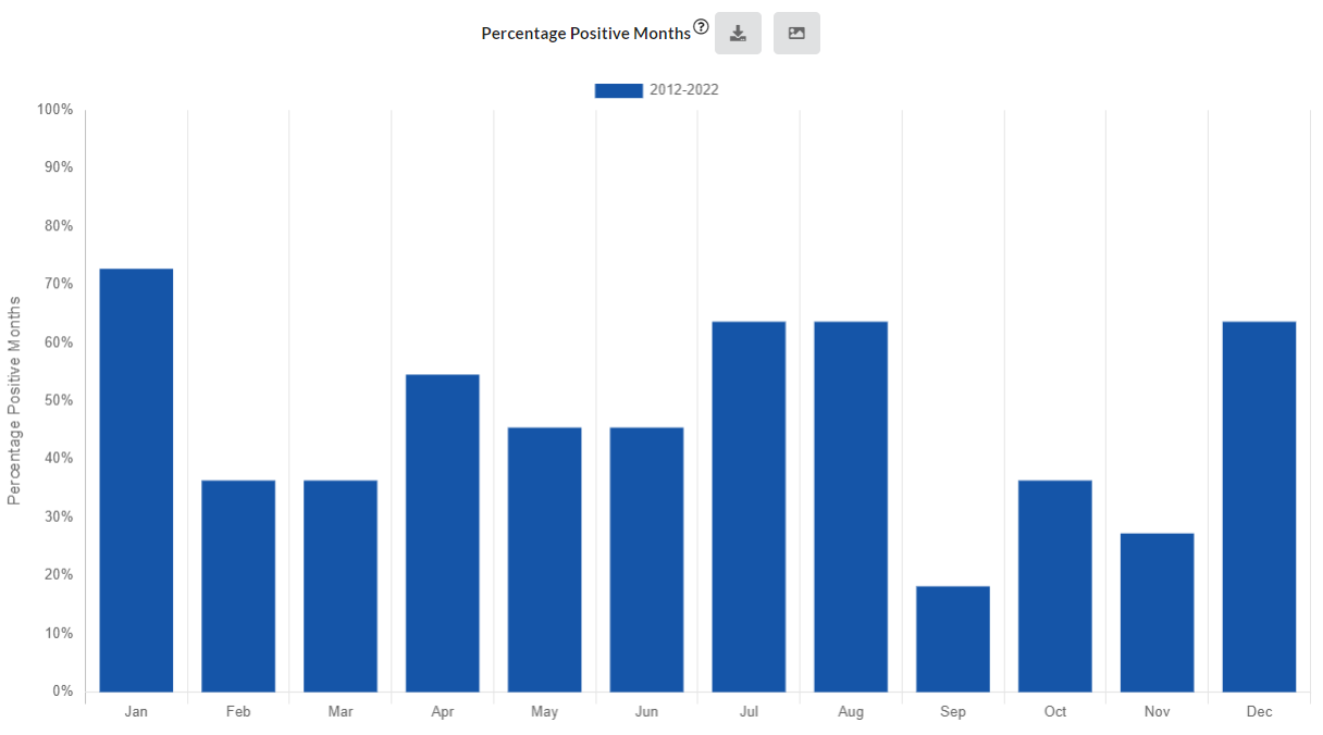
Percentage Positive Months chart
Percentage Positive Months chart shows the percentage of months that had a positive return in the selected years.
It is the frequency of the times when the Ticker closed above the opening price of the month.
Watch the tutorial if you have any doubt.
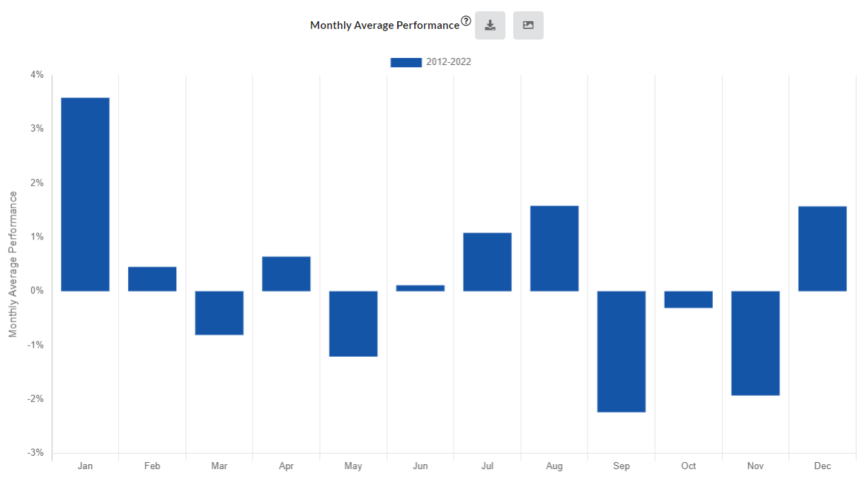
Monthly Average Performance chart
Monthly Average Performance chart shows the average performance of the Ticker on each month in the selected years.
The monthly performance is the percentage distance between the first opening price and the last closing price of the month.
Watch the tutorial if you have any doubt.
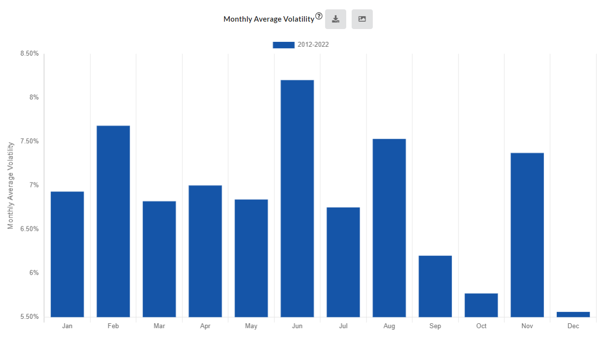
Monthly Average Volatility chart
Monthly Average Volatility chart shows the average monthly volatility of the Ticker in the selected years.
The volatility is computed as the average percentage distance between the highest high and the lowest low of the Ticker on each month.
Watch the tutorial if you have any doubt.
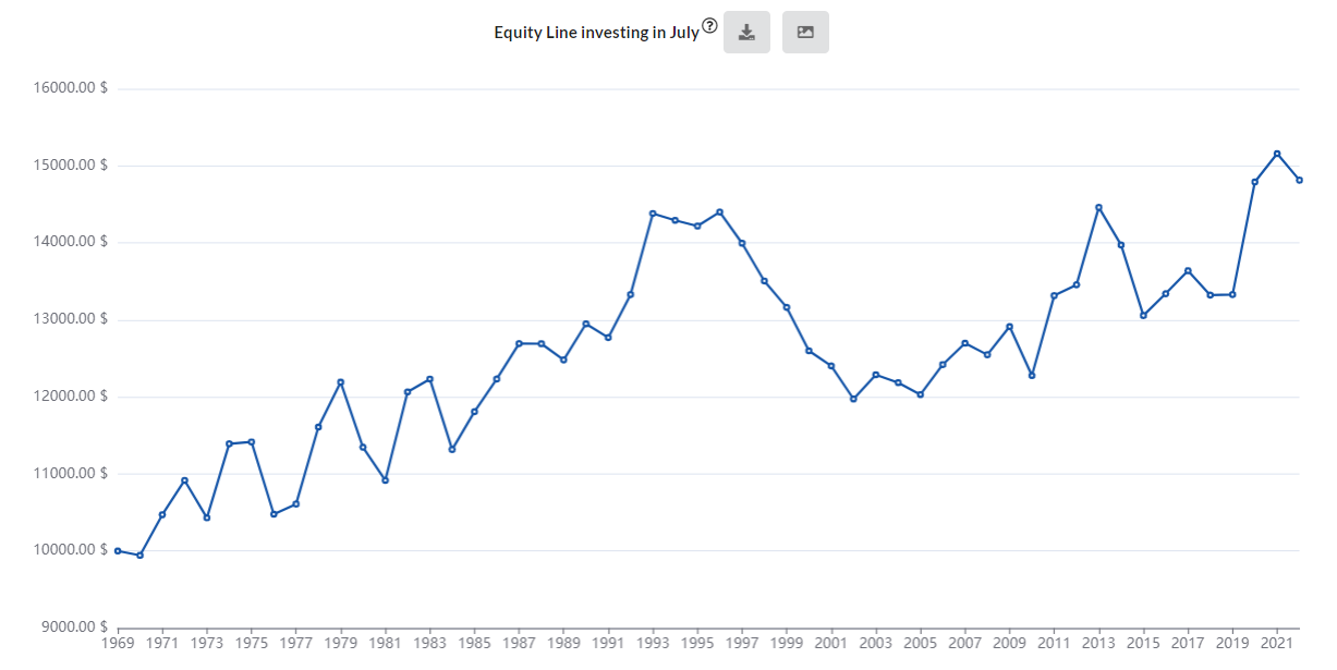
Equity Line investing in the current month
Equity Line investing in the current month is the result of a backtest done:
- in the entire historical data, from the 1st year to the current one
- with a starting capital of 10,000$
- in composite capitalization
which consists in:
- buying the Ticker on the first open price of the month, and
- selling it at the last closing price of the month.
Watch the tutorial if you have any doubt.
Equity Line investing in all different months
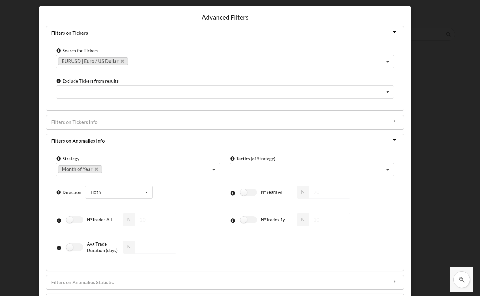
It's possible to see the Equity Line investing in all the different months, from the Seasonal Anomalies section by using Advanced filters, and filtering for:
- Ticker: the ticker you want, for example EurUsd
- Strategy: Month of Year
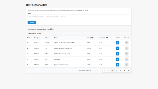
The explanation of Seasonal Anomalies page is available in this article.
Videos on YouTube
Seasonal Charts presentation and tutorial are available on YouTube